
|
Getting your Trinity Audio player ready...
|
Identifying Trends
There are multiple factors to be taken care of while carrying out technical analysis to identify trading opportunities, and the most crucial among them is identifying trends and trend reversals. Being a practitioner of TA, here are some of the ways of identifying a trend reversal:
Closing Prices
As a matter of fact, Dow Theory revolves around the closing price, and not intraday price movements. Hence, followers of Dow Theory observe only the closing prices, and use only the closing prices to determine the direction of the market. Closing prices with consecutive lower lows during a primary uptrend may hint of trend reversal. Similarly, closing prices with consecutive higher lows during a primary downtrend may point towards an oncoming primary uptrend. In addition to closing prices, line ranges are also used to distinguish a trend reversal from random misleading price movements.
Line Ranges
A more visual approach of identifying trend reversals is line ranges. Most of the price graphs and charts have trade ranges, which represent the range of a trend. If prices cross these ranges or trend lines, it may indicate a change in the direction of the market. In the majority of cases, price movements breaching the trend lines is a signal of trend reversal.
Signals
Any primary trend is composed of successive peaks and troughs forming in the direction of the trend. When a trend reversal knocks, the opposite of this happens; successive peaks and troughs in a direction opposite to the primary trend.
Trend reversal during a primary uptrend looks like a transition from higher highs and higher lows to lower highs and lower lows. A transition from lower highs and lower lows to higher highs and higher lows during primary downtrend signifies a trend reversal.
Charts: Because markets speak!
We have a brain to process our thoughts and speak what we think is apt. Markets are not clever like us, or at least not in the way they speak through charts. Anything and everything that is happening in the market is reflected in the charts. Market discounts everything, remember?
So if you are clever enough to read the charts and the information that many may not be able to decipher, you can have great gains in the cryptocurrency market.
Before you start reading the charts, you need to know what to look at. And it all begins with observing the four most important points in a cryptocurrency market chart: Open, High, Low, and Close. Please note that unlike the stock market that opens at 9:15 AM and closes at 15:30 PM, cryptocurrency markets are considered open at 0:00 UTC on the present day and close at 0:00 UTC on the next day.
Open: Number 1 is the ‘Open’ and shows the price of the first cryptocurrency trade of the day, at or after 9:00:00 AM.
High: Number 3 is the ‘High’, which represents the highest price at which the cryptocurrency was traded during the day.
Low: Number 2 is the ‘Low’, and it defines the lowest price at which the cryptocurrency asset was traded during the day.
Close: Number 4 is the ‘Close’, which represents the price of the last cryptocurrency trade of the day, at or before 8:59:59 AM on the next day.
Together these 4 price points are called OHLC (Open, High, Low, Close), and no matter what kind of chart you pick, data is always derived from these four price points, which are basically the foundational figures in technical analysis. The charts that are analysed with TA always display the OHLC sessions for any particular cryptocurrency asset.
Types of Charts
Charts can represent market data for any duration of time. It does not necessarily have to show a day, a month or a year’s market data. Most of the cryptocurrency exchanges allow traders to see market data for different time periods for different cryptocurrencies, which are usually 1 hour, 24 hours, 7 days, 1 month, 6 months, year to date (YTD), and all-time.
Although there are too many types of charts in the world of stats, thankfully, in technical analysis we only have to learn about three types of charts:
- Line Charts
- Bar Charts
- Candlestick Charts (The one we use the most in TA).
Just to feed your curiosity, candlestick charts hold more market information and are easier to read once to learn how. Let’s see why.
Line Charts
The above figure is a single-line chart showing 24-hour trade data for Bitcoin. In the chart, only the closing price points have been plotted. Although the information one can get from this chart is accurate and usable, it does not include the other three price points. And that’s where the constraint of a line chart comes to light. If we plot three more lines representing the other three price points i.e open, high, low, it gets really confusing to read with all the points floating around and the intersections adding up to the mess, which is why we don’t normally use line charts in technical analysis.
Bar Charts
Bar Charts are better than line charts in the way they can represent all four price points in a single bar. The top end of the bar is considered the ‘High’ and the lowermost end is labelled as the ‘Low’. Open and Close prices could be anywhere on the bar, and may even overlap with High and Low. The length of the bar represents the range of prices for which the cryptocurrency was trading during the referential timeframe.
So, the market data presented via a bar chart may look something like this:
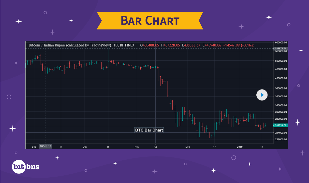
Apart from the organised view, the biggest advantage of bar charts is that they enable us to take a glance at the market sentiment as well, which are of two types:
Bullish: When we say Bullish, it means the market has a positive sentiment, which translates to uptrend. Traders are encouraged to buy more cryptocurrencies in hope of higher returns when taking long-position and are thus willing to pay more for the coin, which pushes the prices further up. When the market is bullish, the opening price will always be lower than the closing price, depicting positive growth in prices. This keeps on going until the trend reverses and the market turns ‘Bearish’.
Bearish: When the market is Bearish, there is a negative sentiment in the market, which means a downtrend in the market. Traders keep selling off to reduce losses, which plunges the prices further. Bearish sentiment is maintained till the trend reverses to become Bullish. In a bearish market, the opening price will always be higher than the closing price, displaying negative growth in prices.
Interesting Fact: The terms Bullish and Bearish actually come from the blood-sport ‘Bear-baiting’ from the 19th century. A bear would be left in a pit to contest with another animal, usually a bull. The sport would go on until one of the animals is knocked out or loses their life. While a bear would attack its opponent in a ‘swiping-down’ manner, a bull would always attack with its horns in an ‘upthrusting’ manner. Hence, the terms Bearish and Bullish, which represent the direction of prices in the market.
Prices go down, the market is bearish; prices go up, the market is bullish.
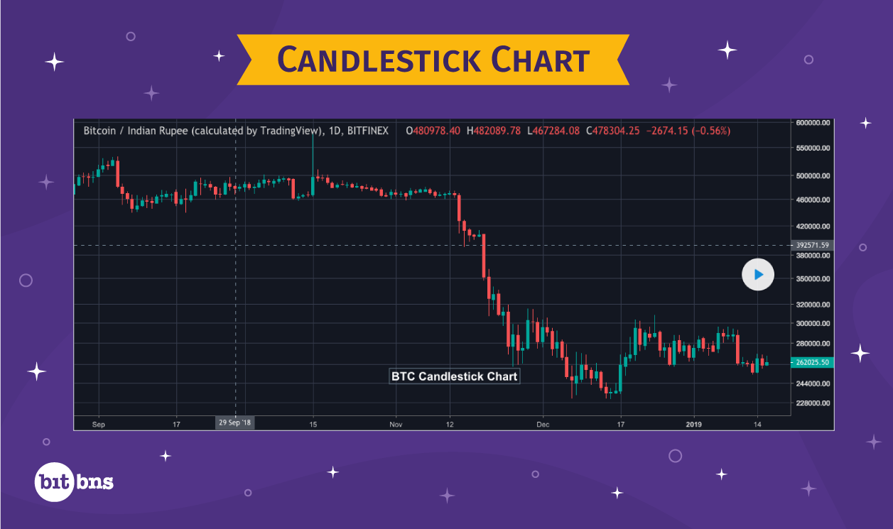
Candlestick Chart
Candlesticks are nothing but bar charts with more details. In terms of readability, candlestick charts are better because they provide a clear, intuitive view of the patterns in the market.
Originated in Japan, candlestick charting techniques were discovered and proliferated worldwide by a trader named Steve Nison. In the present day, Steve is considered the father of modern candlestick charting techniques, and is followed by millions of traders and analysts across the world.
Candlestick charts are easier to understand as the structure of each candlestick is quite self-explanatory and detailed in itself, which is not the case in bar charts. At first, it may look like candlestick charts are similar to bar charts, but remember, when we are trading digital assets, speed and precision are everything. Something that makes candlesticks the preferred choice for technical analysts around the world is the colour coding. The colours for bullish and bearish candlesticks are different in candlesticks, unlike that in bar charts. A technical analyst does not have to focus on differentiating between which of the candlesticks indicate negative sentiment and which ones indicate positive.
Another factor that candlesticks are recommended for is the length of candlestick, which shows the range of trade action for the timeframe. The longer the candlestick, the higher the buying and selling activity.
And this is what makes candlesticks easier to read and deliver useful information to a trader at a glance.
Bullish Candlestick:
This is what a Bullish candlestick looks like:
As you can see, there are three components of a bullish candlestick:
Upper Shadow/Wick – The link between ‘High’ and ‘Close’
Central Body/Body – The rectangular shape that connect ‘Open’ and ‘Close’
Lower Shadow/Wick – The link between ‘Low’ and ‘Open’.
So if we have following OHLC values:
O – 110
H – 140
L – 100
C – 130
The Bullish candlestick would look like:
Notice that the four price points are aligned in an ascending order from bottom to top, just like a bull attacks its opponent in an upthrusting manner. Hence, a bullish candlestick is read from bottom to top.
Bearish Candlestick
The bearish candlestick has the same components as the bullish one, except that it is the exact opposite of a bullish candlestick. As bearish candlesticks show negative sentiment in the market with ‘Close’ being always lower than ‘High’, they look like something like this:
With O = 120, H= 130, L= 90, C= 100 values respectively , this is the picture of bearish candlestick.
The direction of reading a bearish candlestick is from top to bottom, similar to how a bear attacks in a swipe-down manner.
The Candlestick Chart
So now that you have mastered the art of reading candlesticks, let’s see how you do with a candlestick chart.
Here’s a sample candlestick chart of Bitcoin that shows a week’s trading history.
Remember, the timeframe that you set for a chart shall be according to the frequency of your trading activities. For example – if you are a day-trader, you should be looking more at the 24-hour charts. If you are an arbitrager who seeks ephemeral opportunities, you should be looking at the 5-minute chart. You can find cryptocurrency trading charts with timeframes as small as 1-minute on few websites:
- (TradingView) https://in.tradingview.com/
- (DailyFX) https://www.dailyfx.com/bitcoin
Candlestick Patterns
The utilisation of candlesticks in TA is no different from other types of charting techniques. However, compared to other options, candlesticks are significantly better at reflecting trends and patterns in the past market data of cryptocurrencies.
In this section, we will look at some important patterns in candlestick charts that make it significantly easier for a trader to make an informed decision.
Human psychology has a huge role to play in the price fluctuations of cryptocurrencies. You, as well, are a part of it, and just like any other trader, you would be compelled to take action upon spotting a trading opportunity. It wouldn’t be wrong if you said that the potential of human psychology to affect the cryptocurrency market is decentralised; nobody is particularly responsible for a pattern emerged out of a psychology, but at the same time, everyone is contributing towards it. Roughly, spotting a trading opportunity in advance translates to identifying a pattern in the charts.
But the question arises, “What is the actual significance of learning chart patterns” and “how does it help you as a trader in a real trading scenario?” To understand that, we will first have to learn how a pattern is formed and what it changes for the investors.
Consider this made-up example:
On 1st January 2014, the market saw an unanticipated 20% decrease in the price of cryptocurrencies. Consequently, the trading volumes saw an approximate 15% rise because of the panic selling by traders selling their positions. It took three days for the market to recover to its original state. To sum it up, from 1st January to 4th January, the market saw an unexpected short-term bearish sentiment.
One year later, on the same day, the same price action was observed. An increase in the trading volume was noted, along with a fall in the prices due to more traders wanting to sell cryptocurrency even at minor loss. The year next to that also saw the same pattern in trade activities.
What does it show? It’s that history tends to repeat itself; one of the three assumptions in TA that we already discussed, remember? More so, history tends to repeat itself because the market psychology makes it happen. In the case we have discussed above, the short-term sentiment recurs because traders across the world have led to a composite psychology tied up to the crash that happened back in 2014.
This is how sentiments drive a market and, at times, result in recurring patterns and trends that maintain their existence over a long period of time.
There is no doubt about the fact that market psychology is as real as it can be. Even the stock and cryptocurrency exchanges are wary of this fact and have reacted to it from time to time. A classic example would be when NYSE and NASDAQ were shut down, in order to avoid further market crash, from 12 to 17 September following the 9/11 tragedy, which induced panic selling to cause the greatest loss percentage of 7.1 in the history of stock exchanges. In terms of how trader sentiments move the market, cryptocurrency markets are no different.
Given the importance of market psychology, it becomes imperative for a trader to learn how to analyse the market psychology always in advance, if possible. Thankfully, we have just what we need, which is called Chart Patterns.
Chart Patterns are geometric shapes formed in the market charts. Essentially, patterns represent the ongoing market psychology and provide clear price signals, based on which technical analysts can predict which way the market will go. Some patterns are essentially repetitive, while some are irregular, but all in all, all chart patterns have clear definitions.
Now that you know what chart patterns are, let’s learn about the most noted chart patterns and their interpretations. There are two types of patterns in TA that we would discuss at this juncture:
- General Candlestick Patterns
- Classic Price Patterns